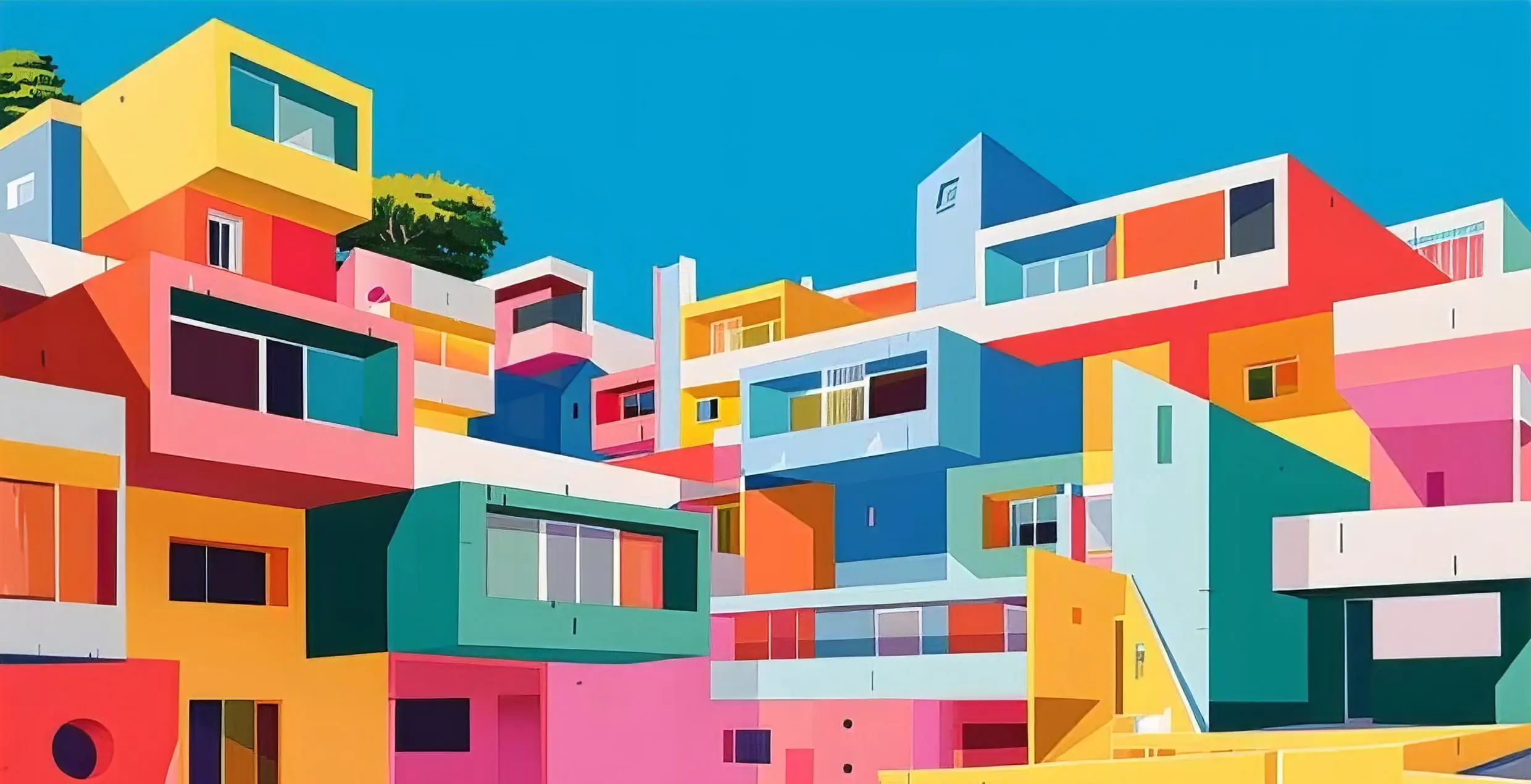
We’re proud to highlight the widespread adoption of CoreCivic’s Trauma-Informed Color Playbook, which was developed in close collaboration with GB-A and now guides the look-and-feel of their facilities across the USA.
The Color Playbook is an integral component of CoreCivic’s normalisation approach. Drawing on GB-A’s expertise in trauma-informed design, this playbook offers a carefully considered rationale for each colour choice, alongside practical guidance for its application in correctional and detention settings.

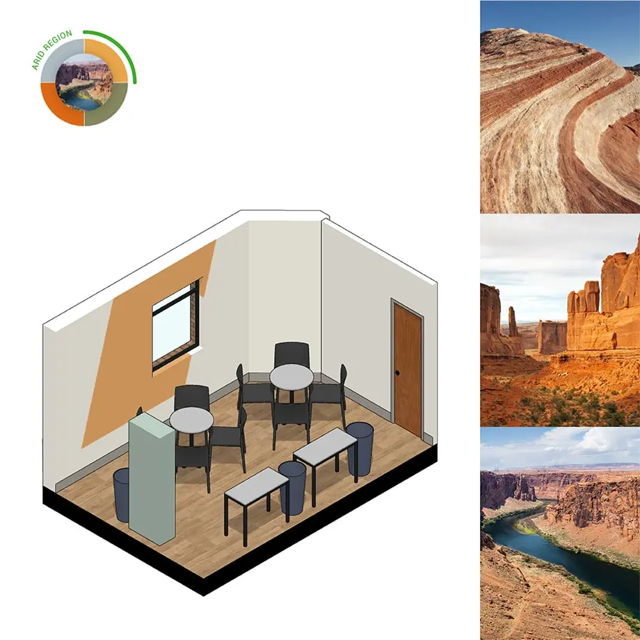
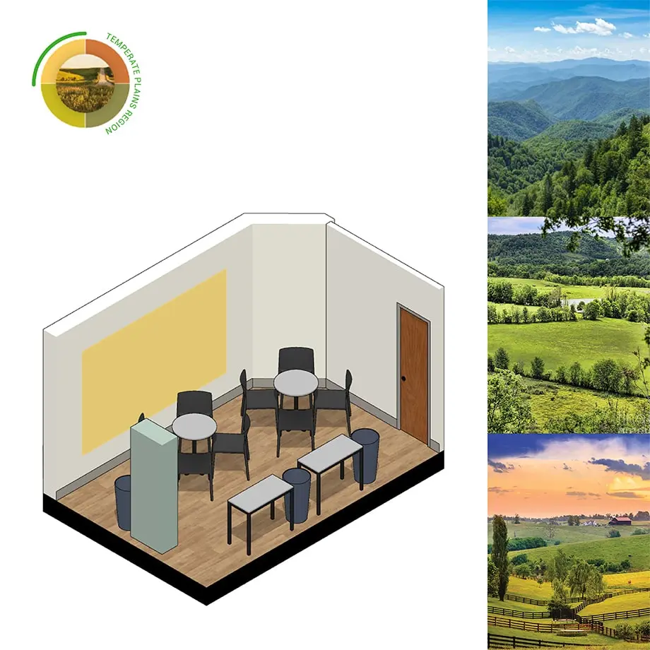
Colours were selected to resonate with the regional context of each facility, with examples like warm earthy tones of orange and red used in desert regions to reflect the natural geographical environment.

The impact has been striking. According to CoreCivic, over 95% of residents in newly painted housing units reported a noticeable improvement in their mood, both during the day and at night.


Staff members have also expressed their enthusiasm, with many citing these newly designed spaces as their preferred units to work in, noting the positive atmosphere and overall improved environment.

This initiative underscores the power of thoughtful design in rehabilitation settings, demonstrating how subtle interventions like color can create a more supportive, human-centered space for both residents and staff.

We are proud to have contributed to this project and thank everyone involved in bringing it to life.
UP NEXT


